Friday, November 20, 2015

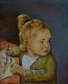
Mom


Mom

20" x 16"
Oil on hardwood Panel

[click on the image to enlarge]


At this Thanksgiving season, of all the things to be thankful for our wonderful mother is high on the list.

I'm thankful for her years of lovingkindness.

And thankful that she has been preserved to her ninetieth year and still going strong.

Love you

Thursday, November 5, 2015

High Country Autumn


High Country Autumn - Study

12" x 16"
Oil on hardwood Panel

A small study in design and value in a warmer palette.

Some value stacking and value masses.

A relaxing bit of work.

Saturday, October 31, 2015

Emerald Valley


Emerald Valley

12" x 16"
Oil on hardwood Panel

The landscape study is done in an unusual pallet in Gamblin oils:   Phthalo Emerald, Cobalt Violet and Asphaltum. This is a pallet of secondary color: green, violet and an orange brown with no primary color.

The drawing and under-painting were done with Burnt Sienna which is also an orange brown hue which shows through in spots, especially as the Asphaltum is transparent and the other two are semi-transparent.

Mostly this is a study in mood and value

I wanted a misty, foggy feeling in this scene.

The foreground is deliberately not distinct, so that the viewer's eyes pass over it into the woods and thelight. The painting is about how light touches each area.


Tuesday, October 27, 2015

Foothills Stream


Foothills Stream

18" x 24"
Oil on hardwood Panel
[click on the image to enlarge]

This started as mostly a design project, so it involved value choices.

It also has some of the warmest shadows that I have painted. It has a lot of green throughout but it is broken into many variations and values

Additionally I wanted to put some wildlife into the scene but I didn't want the focus to become the wildlife. 

Most landscapes don't have any for that reason - the conflict in the focus and eye movement about the painting.

So by design I put two deer into the shadows. They are there however they don't jump out at you, sort of like deer do in their natural state.

Again an attempt at unity

Check back in three months and we will see if I have reworked parts of this painting

Waterfall Study


Waterfall Study

24" x 18"
Oil on Panel

The foreground water and the submerged rocks were so interesting that I wanted to try painting that effect.

Unfortunately I did that first and then having all the fun stuff done I was left to do something with the rest which had been  only roughly drafted. 

So it sat near the easel for about two months and every once in a while when I had an extra few minutes of leftover paint or something I would pick it up and play with it

On the other hand if I do the work part first then sometimes I lose focus on what I wanted to paint.

Anyway I still like the rocks and the pool and despite it's history it still has some reasonable unity.

Wednesday, October 7, 2015

Violet


Violet

24" x 18"
Oil on hardwood Panel
[click on the image to enlarge]


I wanted to try painting my grandmothers. However since neither one is still with us, it will require photographic references.

Grandma Whiting was so fill of life and had a wonderful nature so that any attempt to portray her very well is surely going to fall short. Maybe the painting can suggest or remind us of something about her.

As I recall this [modified] chair was her favorite one.

Thinking about her while painting this made me miss her even more. It will be wonderful to again see her some day

I will probably try this again if I can get a reference photograph that is more suitable - this painting is a composite from several.


Sunday, September 20, 2015

Morning Prayer


Morning Prayer

24" x 18"
Oil  on hardwood Panel
[click on the image to enlarge]


The painting was inspired by the morning routine at the Brock household, where a wonderful family is being raised in love and faith.

Rebecca took the reference photograph.

It feels a little intrusive to share this intimate moment even when posed.

I will probably continue to work on small problems with this painting - it is special to me, however for now it feels complete

Both cobalt and ultramarine blue were used, it gives some variation to the dress. There is even some ultramarine blue in the darkest areas of Emery's hair.

Painting this was a great experience.

It is interesting to consider how it would be altered in a white dress
Thank you to Rebecca and Emery


Saturday, September 12, 2015

Friends


Version with a higher value grey background


Friends

20" x 16"
Oil on hardwood Panel
[click on the image to enlarge]

Gweneth is a wonderful subject.

Just fun to be around.

Following her Grandma Lori's example, she likes all animals and is caring and warm.

Katie posted a group of pictures and I couldn't resist trying my hand at editing one of them to create a moment

I also painted this with grass, some shrubbery and a flower pot however in the end I liked the simple emphasis of the two of them.

Incidentally there is no blue in this palette. The eye 'reads' it as bluish because it is surrounded by warm yellows and reds.


Sunday, September 6, 2015

Wet Sand - 2


Wet Sand - 2

18" x 24"
Oil on hardwood Panel
[click on the image to enlarge]

I enjoyed the first time working with this subject, so I put a similar pose on a larger panel and reworked it. With a larger canvas more detail is needed to carry the effect.

This is a warmer palette. [Besides changing the hue for the swimsuit of course]

Campbell has strong features and I was pleased to be able to suggest her face with only a few hints of shadow.

There is a bit more emphasis on the ponytail feature this time. Only sand for the background, no horizon or sky influence captured.

I don't know which one I prefer.

Monday, August 31, 2015

Wet Sand - 1


Wet Sand - 1

16" x 12"
Oil on Hardwood Panel

This painting was very enjoyable.

The design was pleasing and I could move it around and try different effects.

I like the unity

Campbell is the model on New Brighton Beach


Sunday, August 23, 2015

Study


Study

16" x 12"
Oil on Panel

The small study was done to explore design.

It does not have the right shadows to be very workable for me. As noted before the camera setting make the blue much higher value than the painting.

I like the pose and wish that the photograph had different lighting.

Those flowers look  pretty darn washed out!

Sometimes a design doesn't work for me however the model is so cute I decided to post it anyway.
Lori is standing in our back yard when we lived on Laurelview in Carmichael. Back in the peaceful days before children, etc.

Aw, serenity.


Tuesday, August 18, 2015

Ripples


Ripples

18" x 14"
Oil on hardwood Panel
[click on the image to enlarge]

A little play with a cool palette. I enjoyed pushing the colors around and arranging the design.

Except for Gwen the colors are very cool and low key.

As I've mentioned before  she makes me smile and her simple gesture was expressive. Besides it was either this or paint the bright cowgirl boots she wore later in the day...

Life will always be interesting with Gwen.


Saturday, July 25, 2015

Horizons


Horizons

24" x 12"
Oil on hardwood Panel

How many choices, experiences and opportunities will the future bring for this young man?

Will he be prepared and make good choices?

Will he make corrections in those choices when needed?

Morgan took a very thoughtful picture of Grant that made me think about these ideas. Grant is being well prepared for that time.

We all have the future before us. The opportunities and blessings will be there, however the final result will also be our choices.

It is significant to me that we cannot see beyond our immediate horizons, but we do have impressions or plans for that time.


Sunday, July 12, 2015

Griffin


Griffin

16" x 12"
Oil on hardwood Panel

This special little guy was dressed to attend his uncle's  wedding reception.

This is not exactly a gestural painting however I did want to show something about him aside from how he looks in a white shirt.

He has a generous and spiritual center.

The camera likes the blue and tends to lower the value, it's about two steps deeper into navy or ultramarine than the photo suggests.


Sunday, July 5, 2015

Quinn Distracted


Quinn Distracted

20" x 16"
Oil on hardwood Panel


This painting was partially done for several weeks. After getting the design ready I did the under-painting with Burnt Umber to create forms and to adjust the values.

Then it sat while I did other projects.

Campbell chastised me that I should complete my paintings before moving on to do others.

This came together very rapidly when I restarted. The face and hair model so well.

Of the painting subject matter, Quinn doesn't like to miss anything going on nearby, although I might add that the Powers girls are champions at that also.

Thanks Quinn


Monday, June 29, 2015

Adalyn


Adalyn

20" x 16"
Oil on hardwood Panel
[click on the image to enlarge]

This cute little mite is my niece, Adalyn.

She has been traveling with her parents recently and some of the photographs caught my interest.

I wanted to make a more colorful infant portrait.

After getting the basic sketch in place, I experimented and played with the colors.

Infants are so helpless, they can't really object no matter how we dress them. Besides I believe she is a bit too sweet to complain.

The green is a Phthalo Emerald color by Gamblin. It is a very powerful hue and I like it better than the more usual thalo green which has more blue in it. The dress has a good bit of Quinacridone Rose although neither are pure at any point on the painting.

I imagine that I will keep looking at it and making small changes however I decided to publish it anyway. After all the changes may make it worse - it's happened before.


Saturday, June 20, 2015

Sunrise Dairy


Sunrise Dairy

24" x 30"
Oil on hardwood Panel
[click on the image to enlarge]


Whiting Sunrise Dairy in Lewiston, Utah is the place that I remember most often when I consider my childhood, although it was really mostly my teenage years.

The best place to raise the 5 Whiting kids.

Like homes a working farm is a place that is always changing. The crops are planted, grow and are harvested and stored. The animals need attention, feeding and the cows are milked twice daily. Similarly the buildings and landscaping change over time. So some choices had to be made when considering this painting.

Many buildings including the home, the small garage, the large red barn and the milk annex no longer exist, except in our memories. And everything could not be included so the solid, wood grainery, the corn pit, the calf sheds, the pig pens and most of the equipment are not visible. The canal, irrigation ditches and sprinkler pipes and manicured fields of corn, barley, alfalfa and wheat are behind this scene.

Some things are constant such as dairy cows, feed for them, a large garden and chores.

I wanted the sunrise aspect to be dominant and the sunrise within the painting, so it was necessary to make some adjustments and thus to allow the dairy to face west for this purpose. This also nicely puts some more interesting mountains behind the buildings.

This was another fun painting to work on. Every building and item has some memories attached to it. For example the brick chimney was shaken during the Richmond earthquake and fell off the house going behind the bedroom. We are fortunate that the individual bricks rolled down the roof rather than crashing as a large mass into the home.

The red barn had two parallel rows of stalls to milk cows behind the sliding door- one row to the right and one to the left. The leanto annex on the left side was used to store supplies the one on the right side had shop tools. The barn had a full floor above the milk area and was used to store bales. Also had a few bats up in the rafters.

The painting is worked mostly in grey hues with accents. It is a larger painting than the previous two landscapes.

I hope you also noted that though it is early morning and the house and general area is quiet, the lights are on in the milk annex as dad goes about the first morning chores. The last chores of the day will be about 14-15 hours later.

Because of the greys and the limited palette this painting is very subject to ambient lighting. In some limited light it appears to be first dawn as night starts to wane. With more light flooding the central portion it becomes a brighter sunrise.

I love these memories of home.


Wednesday, June 10, 2015

Life in the Fields


Life in the Fields
JHC Country

18" x 24"
Oil on hardwood Panel
[click on the image to enlarge]


My dear mother will also celebrate a birthday of note a little later this year.  Since I'm her favorite child, I wanted to paint something from her childhood. [Really, the competition for that title is quite limited....]

This painting is  a painting of memories and family ties.

John Hartley Carlile [JHC- from the brand that I created a couple of years ago in his memory] and his perpetually cheerful wife Florence raised a family of four children in these homes.

The Carlile's were lots of fun to visit and as kids we always looked forward to seeing them. When I got a little older I was allowed to sleep in a very small upstairs bedroom. The bedroom was small, with sloping walls tucked into the attic,  and was reached by climbing up a steep and narrow stairway. It's small window looked out towards the Quaking Aspen on the left side.

This painting's theme  works around late summer in the farming fields. The palette is much warmer.

Liberty was taken with placing the various elements of the past into this painting. Especially creating a country lane with their first home on the same lane as their later home.

Hart Carlile did love the fields, the animals and the farming life.

The memories of them are warm and joyful. So sit back, relax, have a dish of homemade ice cream,  listen to a story or two and enjoy your visit.


Monday, June 1, 2015

Charleston Homestead


Charleston Homestead

18" x 24"
Oil on hardwood Panel
[click on the image to enlarge]


Since my father enjoyed his 90th birthday this spring, I looked back into our family history to find inspiration for painting.

The red brick home was owned by my grandparents, Wayne and Violet Whiting, while living in Charleston which is a small town in Wasatch County. Charleston also sits on the banks of the Deer Creek Reservoir with the Provo River running into it on the north.

I remember lots of snow as a small child, much deeper than portrayed here.

It was a fun place with many trees and farm animals. My great grandfather and grandmother also lived not very far from here. Uncle Gene and Aunt LaRae lived upstairs with his parents for a time. And we lived next door to the right.

I walked down this road to join my five Charleston classmates in kindergarten. And learned to ride a bike on it after many topples.

The setting though is altered to put local mountains, the fields, the old Charleston ward building and some of the town into the background. They existed however not in the alignment as depicted.

Despite the red hues in the home the painting has a cool palette. And many very warm, comfortable memories.

The home was also the setting for a film called 'Easter Dream'


Sunday, May 17, 2015

Girl in Persimmon


Girl in Persimmon

20" x 16"
Oil on hardwood Panel
[click on the image to enlarge]


A wonderful lovely young lady with distinctive features, eyelashes and hair. I can't resist trying to paint her.

Modeling the forms and features is the really fun part of this painting. And working with the pert little nose and the lush hair - yummy.

Thanks to Emery for once again being my model.

Teaching them while they are Young


Teaching them while they are Young

20" x 30"
Oil on hardwood Panel

The nearly idealistic scene of a mother gathering her children around her to teach them the gospel, share scriptures and instill a testimony is timeless.

Rebecca and the children are the models.

The idea was great and I still like it, however the execution is not so inspired.

So I post this to share the idea and the models faithful obedience.

Quinn joins in even though she cannot yet read.


Monday, April 20, 2015

Judy & John


Judy & John

16" x 20"
Oil on hardwood Panel

While looking at some photographs of children, I came across an interesting photo of Judy.

After some consideration I decided to try creating a painting with this couple. It was done just from photo references and has that limitation.

The clothes have also been altered somewhat to unify the painting.

At some angles the monitor reproduces this fairly well and at others it's very washed out.

It was a fun painting and as John Singer Sargent noted - I hope that I don't loose friends over it. Capturing the light is a challenge. 

They are a wonderful couple - full of wisdom and charity. As a side note, Judy has naturally very dark and striking hair.


Tuesday, March 31, 2015

Beautiful Red Hair


Beautiful Red Hair

20" x 16"
Oil on hardwood panel

This is another of my continuing efforts in portraiture.

Just little changes in emphasis and technique.

As Dad said, it's a lot easier with beautiful models.

I like the unity of effect in this painting.

My rendering of Morgan Holbrook.


Self Portrait


Self Portrait
2015

24" x 20"
Oil on Wood Panel

Since Lori did not like the other portrait I painted last year, it became necessary to try a new effort.

I chose a more classic type presentation

I enjoyed the process. It is an interesting experience to look very closely at my own face and then try to recreate it. Flesh is so different because of the structures and blood under the surface

I couldn't resist adding a few brushes to the painting.


Tuesday, March 10, 2015

Elizabeth and Jeff


Elizabeth and Jeff

18" x 24"
Oil on hardwood Panel

We are so pleased that Elizabeth will be joining our family next month.

She brings  a special glow and will be a great blessing to Jeff.

Since both have attended Brigham Young University the background seemed to be appropriate.

If you are wondering Elizabeth's hair has a deep brown hue rather than the somewhat red cast that the photograph seems to have acquired.


Thursday, March 5, 2015

Rebecca and Spencer


Rebecca and Spencer

18" x 24"
Oil on hardwood Panel


Spencer has very strong facial features and it was fun to paint his portrait for the first time. Rebecca's features and beautiful hair I have worked with previously.

And I felt that Spencer's tie and shirt worked well. Although the shirt in the painting is a bit more subtle than the photograph, the photograph is too intense.

I have done the back ground several times and I'm still not fully satisfied, I may yet change it to a solid medium grey.


Monday, February 16, 2015

Katie & Robert


Katie and Robert
2015

18" x 24"
Oil on hardwood Panel

We treasure the time that we have with this special couple.

Lori said that Robert was more often in something 'outdoorsy' rather than a dark suit, however I liked the feel of it.

Aren't those dimples cute, I mean handsome.