Saturday, October 31, 2015

Emerald Valley


Emerald Valley

12" x 16"
Oil on hardwood Panel

The landscape study is done in an unusual pallet in Gamblin oils:   Phthalo Emerald, Cobalt Violet and Asphaltum. This is a pallet of secondary color: green, violet and an orange brown with no primary color.

The drawing and under-painting were done with Burnt Sienna which is also an orange brown hue which shows through in spots, especially as the Asphaltum is transparent and the other two are semi-transparent.

Mostly this is a study in mood and value

I wanted a misty, foggy feeling in this scene.

The foreground is deliberately not distinct, so that the viewer's eyes pass over it into the woods and thelight. The painting is about how light touches each area.


Tuesday, October 27, 2015

Foothills Stream


Foothills Stream

18" x 24"
Oil on hardwood Panel
[click on the image to enlarge]

This started as mostly a design project, so it involved value choices.

It also has some of the warmest shadows that I have painted. It has a lot of green throughout but it is broken into many variations and values

Additionally I wanted to put some wildlife into the scene but I didn't want the focus to become the wildlife. 

Most landscapes don't have any for that reason - the conflict in the focus and eye movement about the painting.

So by design I put two deer into the shadows. They are there however they don't jump out at you, sort of like deer do in their natural state.

Again an attempt at unity

Check back in three months and we will see if I have reworked parts of this painting

Waterfall Study


Waterfall Study

24" x 18"
Oil on Panel

The foreground water and the submerged rocks were so interesting that I wanted to try painting that effect.

Unfortunately I did that first and then having all the fun stuff done I was left to do something with the rest which had been  only roughly drafted. 

So it sat near the easel for about two months and every once in a while when I had an extra few minutes of leftover paint or something I would pick it up and play with it

On the other hand if I do the work part first then sometimes I lose focus on what I wanted to paint.

Anyway I still like the rocks and the pool and despite it's history it still has some reasonable unity.

Wednesday, October 7, 2015

Violet


Violet

24" x 18"
Oil on hardwood Panel
[click on the image to enlarge]


I wanted to try painting my grandmothers. However since neither one is still with us, it will require photographic references.

Grandma Whiting was so fill of life and had a wonderful nature so that any attempt to portray her very well is surely going to fall short. Maybe the painting can suggest or remind us of something about her.

As I recall this [modified] chair was her favorite one.

Thinking about her while painting this made me miss her even more. It will be wonderful to again see her some day

I will probably try this again if I can get a reference photograph that is more suitable - this painting is a composite from several.


Sunday, September 20, 2015

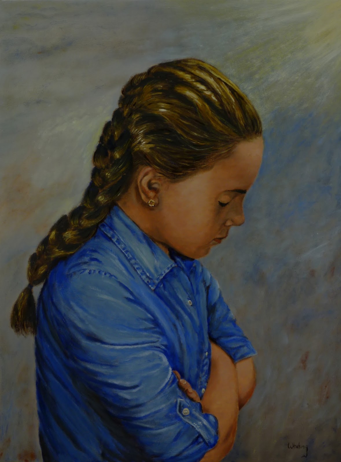
Morning Prayer


Morning Prayer

24" x 18"
Oil  on hardwood Panel
[click on the image to enlarge]


The painting was inspired by the morning routine at the Brock household, where a wonderful family is being raised in love and faith.

Rebecca took the reference photograph.

It feels a little intrusive to share this intimate moment even when posed.

I will probably continue to work on small problems with this painting - it is special to me, however for now it feels complete

Both cobalt and ultramarine blue were used, it gives some variation to the dress. There is even some ultramarine blue in the darkest areas of Emery's hair.

Painting this was a great experience.

It is interesting to consider how it would be altered in a white dress
Thank you to Rebecca and Emery


Saturday, September 12, 2015

Friends


Version with a higher value grey background


Friends

20" x 16"
Oil on hardwood Panel
[click on the image to enlarge]

Gweneth is a wonderful subject.

Just fun to be around.

Following her Grandma Lori's example, she likes all animals and is caring and warm.

Katie posted a group of pictures and I couldn't resist trying my hand at editing one of them to create a moment

I also painted this with grass, some shrubbery and a flower pot however in the end I liked the simple emphasis of the two of them.

Incidentally there is no blue in this palette. The eye 'reads' it as bluish because it is surrounded by warm yellows and reds.


Sunday, September 6, 2015

Wet Sand - 2


Wet Sand - 2

18" x 24"
Oil on hardwood Panel
[click on the image to enlarge]

I enjoyed the first time working with this subject, so I put a similar pose on a larger panel and reworked it. With a larger canvas more detail is needed to carry the effect.

This is a warmer palette. [Besides changing the hue for the swimsuit of course]

Campbell has strong features and I was pleased to be able to suggest her face with only a few hints of shadow.

There is a bit more emphasis on the ponytail feature this time. Only sand for the background, no horizon or sky influence captured.

I don't know which one I prefer.