Tuesday, December 24, 2013

Emmy


Emmy

15" x 15"
Oil on mdf panel
[click on the image to enlarge]

Emery is now 9 years old and a precious, wonderful young lady.

Technically this painting is done with what is sometimes called a Zorn palette. I wanted to try a portrait with this limited palette.

Anders Zorn, a Swedish artist, did much of his work in the nineteenth century. He was noted for beautiful skin tones in portraits and nudes. There is some controversy about exactly what his palette was and how often he used it but general agreement about the basic choices.

Overall I am pleased with the lustrous quality of Emery's portrait. I attribute that to the palette and some to a variation of glazing. I chose the mdf for the ultra smooth surface it provides.

Rebecca took the basic photograph that underlies this painting.


Posted by Picasa

Friday, December 13, 2013

Orphans


Orphans
[after Thomas Kennington]
 
28" x 21"
Oil on Sandeply Panel
[click on the image to enlarge]

I decided to try painting another master copy. I struggled with Tennant's landscape but learned a good deal, so I wanted to try a portrait. I wanted to work on the face and skin qualities.
 
Thomas Benjamin Kennington painted Orphans in 1885. It hangs in the Tate in London, perhaps Morgan saw it.

Skin tones are always a challenge and this was doubly so. Both boys, but especially the right hand figure, have a strong yellow ochre hue. I don't know if this was deliberately done and part of their poverty depiction or if the medium or varnish has yellowed. The effect is somewhat lessened by contrast in that the background has yellow chroma and that makes the skin look less yellow

Additionally they are dirty, especially the feet, so one is trying to paint a reasonable skin tone and then make it looked 'dirty'. Well you usually get dirty, dull paint when you try mixing too many colors, so I was constantly checking to see if the skin was looking soiled or just muddy dull pigment.

I enjoyed working on the clothes, the background and ragged blanket.

The little boy looks directly out at us. However he does NOT expect us to be helpful or caring. He doesn't move or show any facial recognition. Truly his hands 'hang down'

I did take a small liberty with the broken dish in front of them, it is slightly altered from Kennington's original.

 The painting has a shifting perspective, or seems to, and the shelf in the upper right has a similar problem. The only viewpoint that makes any sense would be for the observer to be far to the right of the front of this scene [which also works better for the platform] but the rest of the setup doesn't fit that. Or the shelf must not be square but much wider in front than in the back otherwise we would see the face of the left edge - however it does work as an element which points towards the figures.

Similarly all the legs and arms lead one generally towards the small boy's face. And the larger boy's arms circle and touch the little one's face. It provides a great focus point and Kennington painted that face about two levels above my results. Perhaps that is why his is hanging in the Tate and mine is not.

The original is 40" x 30" [mine is 70% that size] so I console myself that Kennington could get more detail because he was working on a larger canvas - at least that's my story and I'm sticking to it.
 
I also realized from one of Brad Teare's comments that the only artist's paintings that I want to copy have been painted in a style similar to my own. I admire other great paintings but I don't want to paint them - at least not in a 'foreign' style. I would include in that group the current hyper-realistic or high-definition paintings.

Monday, December 2, 2013

Snowy Ridge


Snowy Ridge

16" x 20"
Oil on Canvas

[click on the image to enlarge]

This high country lake and mountain scene is set in springtime. It is located in Colorado although I have altered it a good deal for this painting.

As I've mentioned before green can be a problem in a landscape and I am pleased with the resolution here.

The water reflections include a couple that are relatively subtle and perhaps don't show enough in this photograph, however I think the eye senses them and it creates a feeling of 'realness'

One simple theme here carries the central mountain hues into other background rocks, and the flowers in the foreground and then nearly unseen it is also present in the rocks on the right front. [and very faintly as a water reflection]. All this creates some unity in the composition.

The dead tree creating a focus point and some tension in this painting was not in the original photograph.
Posted by Picasa

Sunday, November 10, 2013

Cheddar Cliffs


Cheddar Cliffs
(after Tennant)

18" x 24"
Oil on Canvas

John F. Tennant painted this scene about 150 years ago in Great Britain.
 
I appreciate the technical aspects and composition of this painting, so I decided to paint a master copy.
 
Artists have traditionally learned by copying great paintings. This is different than painting the same scene as another artist. In this instance one is trying to reproduce the brush work, hues, values, edges  and unity of the original.

It was very difficult however I felt that I learned a great deal. The painting is more complex than I appreciated when first studying it. I painted it essentially the same size as Tennant [40 x 58 cm].
 
The transparent oxide red in the rocks is also repeated in the soil and then very faintly in the clouds. And similarly the grey in the clouds repeats in the rocks in the foreground. I like how he brought the thin clouds right down into the distant hills.
 
I used a phthalo green for intensity in limited areas while he probably used viridian or even verdegris. 
 
Because the painting is quite dark it is very subject to photographic change depending upon the monitor setting and the viewing angle.

There are two very small figures in the center of the painting. The right hand one appears to be sitting on a large rock. What the heck they are doing there and why he is sitting on the rock really puzzle me. I almost decided to paint the right hand figure erect and walking but in the end I just complied to Tennant's decision. Interestingly he put them where only the top of the left individual is positioned to get a portion of full sunlight.

They are 'there' but not as strong as the elements. 

An additional issue is that Tennant painted this scene more than once with varied values. Since I don't have the original the photographs of the 1868 painting that I used as reference also vary in their rendition. The original is also heavily varnished on the upper right side.
 
The name of the painting naturally leads to the question of the origins of cheddar cheese. I learned that it was nearby.
 
'Probably the most consumed cheese in the world, Cheddar orginated from Somerset around the late 12th Century and took its name from the nearby gorge and caves in the town of Cheddar'

Tuesday, October 29, 2013

After the Storm


After the Storm

21" x 28"
Oil on sandeply panel

[click on the image to enlarge]

There is a peaceful wonderful quality about the calm morning after a night of winter's snow.
The combination of very cold and the clear, bright sunlight is enchanting. The values from almost black to bright 'warm' white in the snow is dramatic. Another contrast is between the sharp edges and the soft snow.

This contrast is also highlighted by the very warm red oxide branches in the center and the cooler greens of the conifers.

There is also a bit of intimacy in the close setting [the observer is very near to the scene] yet it also has an open vista in the background
I worked in a larger size to get more 'volume' and detail into the painting.

It is also a metaphor of life in that we must have opposites to appreciate and enjoy the beauty and wonder of being here on earth.


Posted by Picasa

Friday, October 4, 2013

Autumn Reflections


Autumn Reflections

18" x 24"
Oil paint on Canvas
[click on the image to enlarge]

This painting combines so many wonderful elements of being outside during the autumn season. The weather is cool and you know by the fall leaves and the mature grass and weeds that the growing season is closing, now is the time to enjoy glorious October.

I enjoyed this painting for the extensive water and reflection opportunities. It is full of 'little' elements that hopefully add toward the strong central focus.

Good landscape paintings always have multiple secondary interest centers.

If you are getting tired of seeing water paintings, then you will be pleased to know that the current work on my easel has none. [Don't get too complacent though because I do have another one in the planning stage]
Posted by Picasa

Monday, September 30, 2013

Kittiwake on the Beach


Kittiwake on the Beach

16" x 12"
Oil on sandeply panel
[click on the image to enlarge]

Black-legged Kittiwake are fairly common in Alaska, almost always seen over or near the ocean. They are often in groups.

This is a small gull with long wings and a small bill. The bird in the painting is seen in winter [non-breeding] plumage.

The model for this kittiwake was a photograph taken by Jeff Poklen,
www.pbase.com/jpkln
I appreciate his permission to use this model

This painting was done with Torrit Grey, Ivory Black and Titanium White on a gessoed panel. I thought that I would glaze this with a Cerulean Blue after the shades, edges and values were done however I like it the way it is.

Jeff Poklen also photographed a wonderful Heermann's Gull:
www.pbase.com/image/34533413
Posted by Picasa

Tuesday, September 24, 2013

Winter on the Thompson


Winter on the Thompson

15" x 20"
Oil paint on sandeply panel
[click on the image to enlarge]

This painting continues my present series of paintings with water. This time the water is snow and also the mountain stream.

I was interested in the chroma and values of the snow in several conditions - it is changed by the shade, the nearby foliage, what it is setting upon and whether it is smooth or broken.

The left portion is mostly painted in the shade. Light coming over that ridge then highlights a portion of the right side of the stream.

I like the stillness of the scene and the peaceful repose. None of the snow fall has been broken by tracks and the air is calm.

The water is very cold, flowing gently and then it is almost imperceptibly broken by some warmer hues.

The emphasis here is on the two small conifers and then to a lesser extent the nearby boulder.

I'm again trying to resist my tendency to 'overwork' the painting. Instead put a planned brush stroke down and leave it, rather than smoothing it several times.
Posted by Picasa

Monday, September 16, 2013

Ouray Falls


Ouray Falls

12" x 16"
oil on canvas
[click on the image to enlarge]

I like this one a lot. A study in darks, lights and scenery accents and the tumbling water from a mountain waterfall. The palette is focused and well balanced. The warm and cool portions complement each other nicely.

I was pleased with the rock work on this painting and the creation of depth.

The painting is a bit more saturated than it appears here.

The next two paintings that I am working on also have water as a major feature. So I'm experimenting a bit with various moods and treatments.
Posted by Picasa

Tuesday, September 10, 2013

Gleason Falls in Autumn


Gleason Falls in Autumn

12" x 16"
oil paint on canvas
[click on the image to enlarge]

The autumn scene was also inspired by a John Leavitt photograph from New England.
The intense yellows and fiery reds of the hardwoods contrast to the cool foliage, the shadows and the tumbling water.

It's also an intimate scene - no sky is visible, the upstream view is closed in, and even the water is blocked and contained on the left side. It is a personal experience.

I also enjoyed working out of the shade and shadows on both the right and the left sides.

This painting is more intense than most of my work. The chroma or color saturation is more pronounced. Yet there are also a good deal of muted, grey or halftones in the painting. It's somewhat in the tradition of a Currier & Ives print.

I also tried to paint what I actually see rather than what I think I should see in this view.

Posted by Picasa

Saturday, September 7, 2013

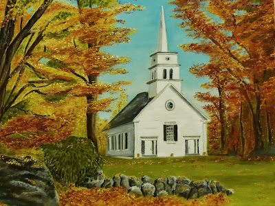
Hillsboro Church at Autumn


Hillsboro Church at Autumn
12" x 16"
oil on canvas
[click on image to enlarge]

Autumn season in New England is always something special. The extra crispness of the fresh air and the wonderful hardwoods do their best to refresh our spirit.
 
Deep reds, variable orange and brilliant yellows all come forward  as the green chlorophyll fades from the growing season foliage. 
 
This painting scene shares the solid, substantial hardwoods with the local congregation's chapel where one may worship the faith of his fathers. Even the deeper granite witnesses the handiwork of deity.
 
This painting was inspired by a John O. Leavitt photograph:  http://www.joleavitt.com
I appreciate his permission to share this. He also enjoys the Maine coast and New England.


Posted by Picasa

Tuesday, August 13, 2013

Playing with Toby


Playing with Toby

12" x 16"
oil on sandeply panel


This whimsical painting was done while I was studying the composition for a larger work.

I ran across some photographs that sparked an idea that I wanted to paint.

A young boy and a lively puppy make a happy combination. Liam and Toby enjoyed playing and teasing about who had the red ball.

Technically it is too small for very much definition on Liam's face and outdoor scenes with that much green are a challenge. Toby makes a good subject in any size. This was also a new experience in that the panel does not have canvas over the surface, gesso was directly applied to the panel and the panel was then given a color undercoat.

Posted by Picasa

Wednesday, August 7, 2013

Summer Baptism


Summer Baptism
Emery

16" x 20"
oil on linen canvas

This painting tries to project the purity of this precious young girl, who has prepared for her baptism.

Without reminders she faithfully read the Book of Mormon. That was a commitment she had made in the year prior to her baptism. Not as easy task for anyone but especially a seven year old. She was and is a good example for her sisters and brother.


White is a good symbol of purity and the new life after baptism. It also represents the celestial kingdom - appropriate since baptism is the entry ordinance.

The background is cheerful and light infused. I like the fresh feeling when combined with Emery.


Framed with a linen insert.
Posted by Picasa

Saturday, August 3, 2013

Dawn Perch


Barn Owl

16" x 20"
oil on canvas
[click on the image to enlarge]

Barn Owls are fairly common and widespread although not seen nearly as often as other less common birds. However they do tend to start hunting at dusk and stay active into the early morning after dawn, especially during the summer when they are feeding young and their choice of nesting sites is sometimes not very private.
So finding one hunting in the open after dawn is not too rare.

They are highly desired in many areas because their diet is primarily rodents. A nesting pair can dispatch more than a thousand rodents in a year.

They do not hoot. And they are not part of the typical or 'true' owl family. The owl pellets they produce consisting of the remnants of fur, bones, etc. from their meals are widely dissected in high school biology classes.

The model for this Barn Owl was from a great photo taken by Steve Stump - http://www.flickr.com/photos/stevestump/9233102080/
[used with permission]


Slightly different camera settings for this photograph.

Posted by Picasa

Sunday, July 14, 2013

Dandelions


Dandelions
 
24" x 24"
oil on linen canvas
[click image to enlarge]

The inspiration for this painting came from a photograph of Grant on Morgan Holbrook's blog. The photo also had great light contrasts.
 
He enjoys being outdoors and exploring nature. I love the sunshine contrasts in the original photograph and his little boy jeans.
 
It is a nearly iconic scene from childhood - picking a dandelion and then blowing away the seed cloud.

Sarah Croft also did a painting on this subject that I have enjoyed.
 
This painting is done on the first canvas that I have made, after a technique suggested by Dan Schultz and described on his website. [He also painted a wonderful childhood scene with a similar lighting contrast on a little boy]
 
The linen canvas was glued to a smoothed OSB panel and then prepared with a coat of gesso, followed by a colored ground coat. It was sanded between coats and I love the tight, smoother surface this created.
 
[The previous paintings were all done on stretched cotton canvas]
 
 
The painting is also shown framed below. I may try a frame with a more antique gold finish later.


Posted by Picasa

Saturday, July 6, 2013

Strider


Strider
12" x 16"
oil on canvas
 

A Strider is bicycle for the very young. It does not have pedals or a drive chain. So it is a play bicycle that one can walk around. Small and shiny.

It was easily Gwennie's favorite Christmas present. It did not matter to her that it was also NOT her present, however she quickly appropriated it and played with it much of the day - including the owner's helmet.

Grant was good-natured about it, or didn't dare cross her. She can be very determined.


Posted by Picasa

Monday, July 1, 2013

I Can Ride


I Can Ride Fast
Campbell
 16" x 20"
oil on canvas
[click on image to enlarge]

The sheer joy of being able to ride a bicycle without training wheels is one of childhood's early milestones. 
Campbell's success is apparent.
With her Mediterranean complexion and beautiful hair she is also a whirlwind of energy and emotions.
Life will always be interesting near Campbell.


Framed

This is primarily a back lit scene, however to give some detail especially in Campbell's face I have also cast some artistic reflected light on the subject.
Campbell viewed the painting and said "the girl is beautiful. [and it's me]"
I agree
Posted by Picasa

Sunday, June 23, 2013

Quinn


Quinn
oil on canvas
16" x 12"

Quinn, who is a very special little spirit, has been a part of our family for two years. This painting shows her at about her one year old stage.

Her sister was of the opinion that her eyelashes and eyebrows needed to be very heavy to differentiate her from her cousin. She has a big personality to match her dark, long eyelashes
Posted by Picasa

Sunday, June 9, 2013

Ready for Adventures


Ready for Adventures
Grant
16" x 20"
oil on canvas
[click on the image to enlarge]

In the great outdoors with a full collection of good sticks.

What more could a little guy require for adventures and exploration? We should all be so enthusiastic about our opportunities.

The underlying photograph was taken from Morgan's blog.

Shown framed below.
 
Posted by Picasa

Thursday, June 6, 2013

Christening Morning


Christening Morning
18" x 24"
oil on canvas
[click on image to enlarge]

A newborn baby on the day of blessing brings so many poignant feelings. 

Among them:
-Reverence for this precious spirit
-Gratitude to Heaven for sending a special spirit
-Approaching Deity to ask an additional blessing for the infant and the future
-Family relationships
-Joy in a mother's sacrifice to bring forth a new family member
-The wonder of life
-Innocence and purity

Technically this painting was done somewhat in the chiaroscuro pattern with marked contrast between the background and the highlights. Black for the dress was made by mixing two powerful strong complementary pigments, in this case Phthalo Green and Alizarin Crimson which makes a rich, luxurious paint. It also allows small variations in hue not possible with traditional blacks. The extended arm has more crimson while the back of dress has a greenish hue.

The photo below shows this painting with a rather poorly cropped gold frame.


To most viewers the dominant figure in the painting is Rebecca, the young woman on the left, she is the figure closest to the viewer and therefore is larger, she is at the point of the highest contrast in the painting and she is painted with the sharpest details.
She is also on the left, and most of us 'read' a painting from the left to the right like we read text.

One might suppose that it wouldn't make that much difference, however below is the same painting now shown by reversing the photograph. Quite a different emphasis to my eyes.
Now to my eyes, the infant has increased in emphasis [and it is more apparent that the bottom of the white crochet blanket should be darker - and so I corrected it later]
You may see this differently.


Posted by Picasa

Thursday, May 23, 2013

Wanna Taste?


Wanna Taste?
Gweneth
11" x 14"
oil on canvas

Innocence and joy.

Sharing something special.  Gweneth is enjoying the Easter season.
Posted by Picasa

Wednesday, May 15, 2013

Goldfinch in Coneflowers


Just for fun I cropped the photograph of the painting.

I think this demonstrates a problem with the larger work, in that the focus was a bit fractured by the conflicting elements.
This more limited composition seems to work better.
I mentioned the limited palette in the first posting. The purple hues are made with an iron oxide and ultramarine blue mix. They would be brighter with a cadmium red, but I like this shade.
Posted by Picasa

Coneflower Foothills


Coneflower Foothills
18" x 24"
oil on canvas

The idea for this painting began while looking at the back mural in the first endowment room in the Sacramento Temple. That panoramic mural covers three walls and depicts nature scenes in the Sierra foothills and mountains.

The summer section in this 8 or ten foot high work is primarily rolling foothills.

But from there various elements, such as the American Goldfinch pair, the purple coneflowers, the large oak and the skyline were artist choices. The goldfinches would feel right at home in the temple mural as many birds and animals are present.
 
Another reason to paint this was that it offered many opportunities to work with a limited palette of oil colors
The temple mural center section is very yellow hued and I struggled to dial that down a bit in this scene. [still yellow right?] Now if I just had my camera in there to take some high resolution pix.....
Posted by Picasa